Vintage tin inspired room

Last night I was having a little fun creating rooms inspired by various vintage items we have in the store.  It’s kind of a fun exercise and I found that really the options are endless.  So here’s where I found my inspiration for todays design board:

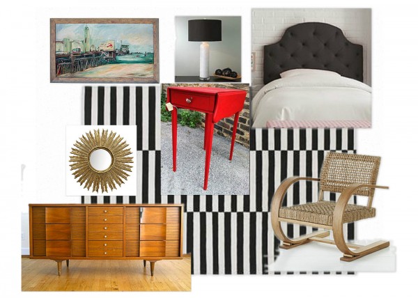
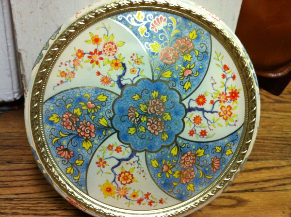
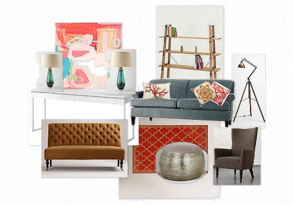
We have some really beautiful vintage tins that are great for hiding little trinkets in the bedroom, kitchen, etc.  The colors on this particular one are so lively yet comforting.  So I gave it a go and this is what I came up with:


I’m not completely sure what the wall color would be.  Maybe a beautiful pale pink, or even leaving them a creamy white while adding some long gold toned drapes on the windows. What do you think?  Could you live in this vintage tin inspired room?  Or maybe just living in a vintage tin is more your style;)  Somedays that doesn’t sound so bad.  For today I’m going to pretend I live in this room all by myself…

Cheers to a vintage life well lived.

Jessica and Julie
House Tour

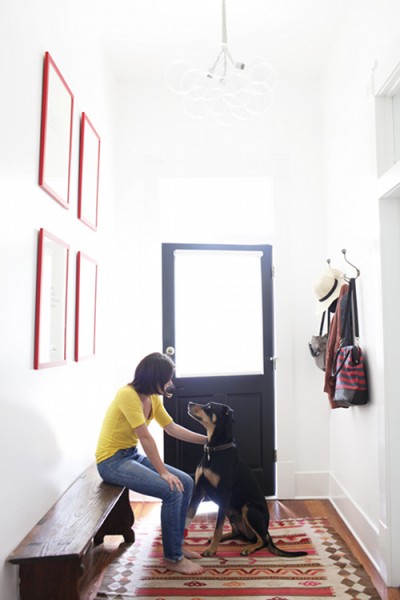
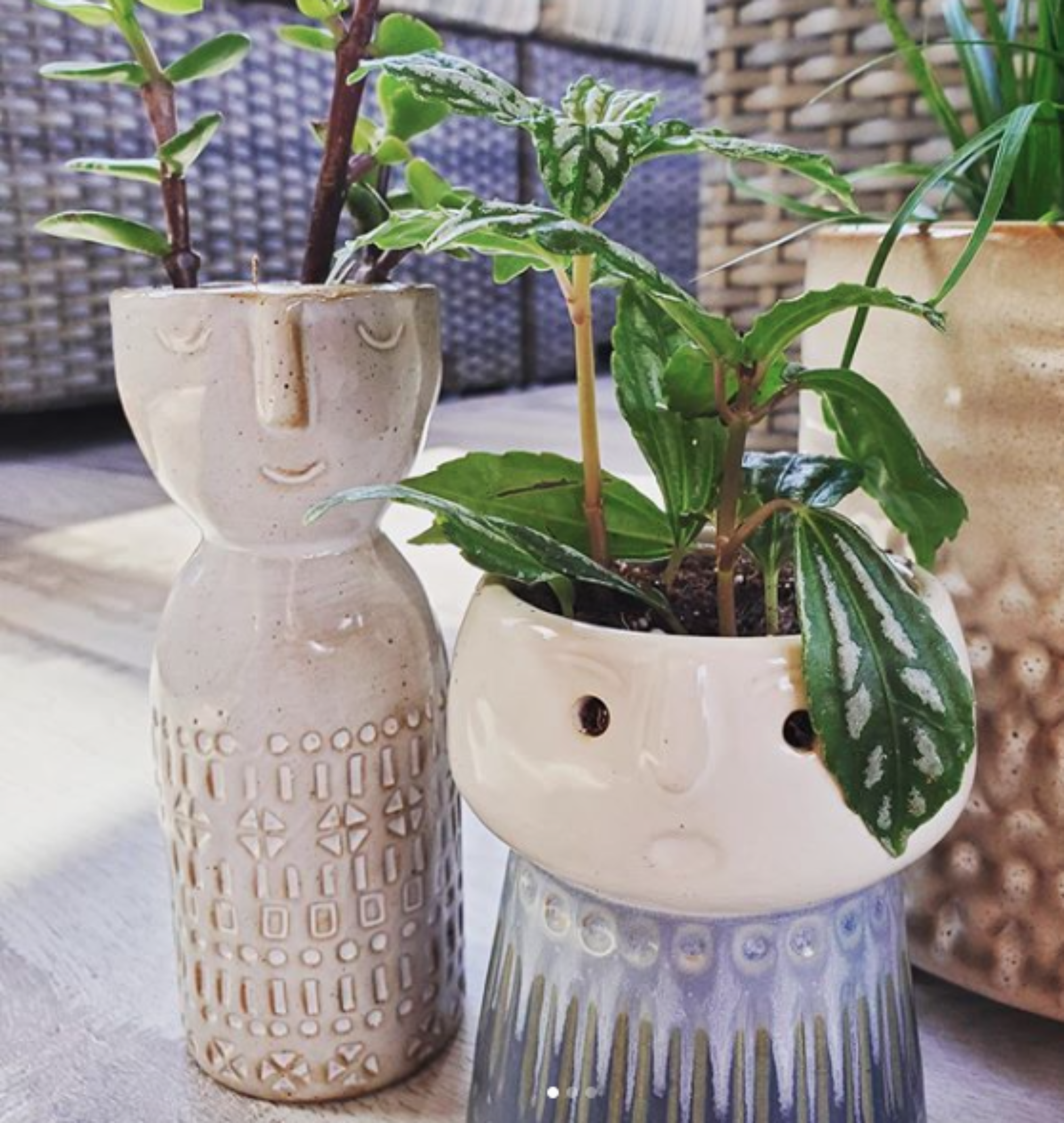
I came across this great house tour a week or so ago.  Some of you Apartment Therapy readers may recognize it, but I thought it was worthy of sharing for a little Monday morning inspiration.  I’m hoping that once the kids are in school a little mental space will be freed up and I’ll be blogging on a regular basis once again.  For now we’ll just take it as it comes.

Anyhow, this home has such a great feel to it.  Don’t you think?

(found here)

I think that might be my dream entryway.  I’ve always dreamed of having an entry big enough for a long bench and wide enough to not feel as if you’re in your guests face as soon as they enter your home.  And I love the sparing decor and general earthy vibe of the space.  But alas, we will not have that sort of entryway anytime soon.  And…life goes on;)  Happy Monday!

Cheers to a vintage life well lived.

Jessica and Julie
Desyrel

A nod to the Land of Nod

Like everyone else in the world, I swear I receive a bizillion catalogs every week for stores I’ve never even shopped at. One for instance is Land of Nod. Sure, I’ve thumbed through their catalogs and their stuff is cute and all, but I never find anything exciting enough to actually purchase. Last week however, was a different story.

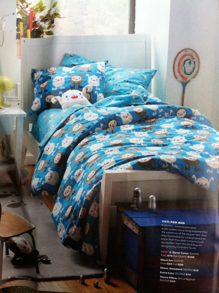
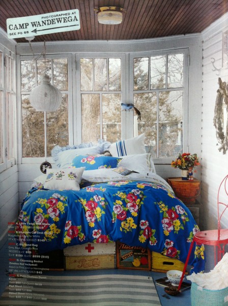
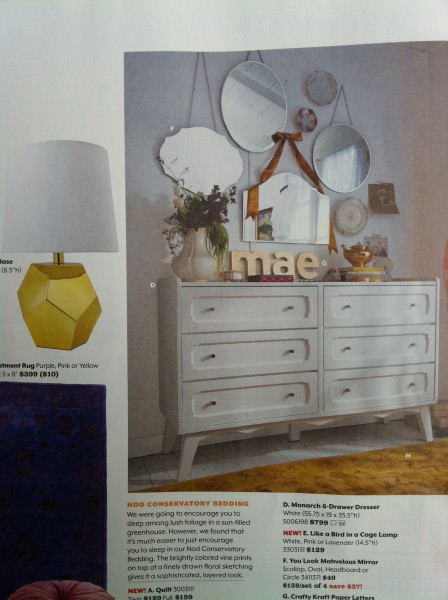
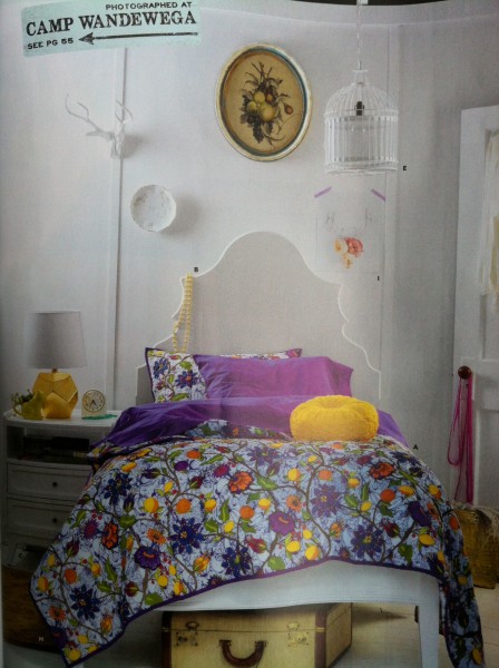
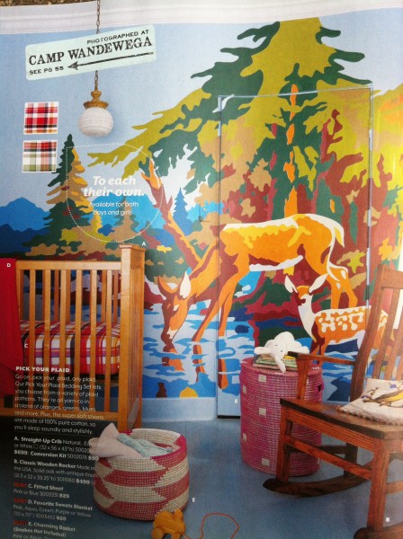
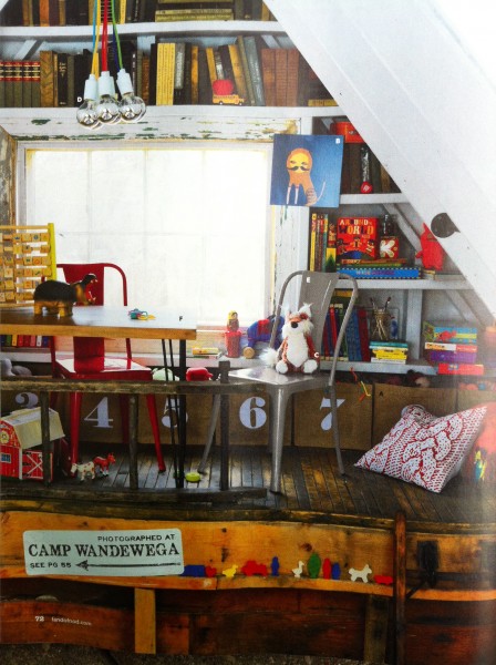
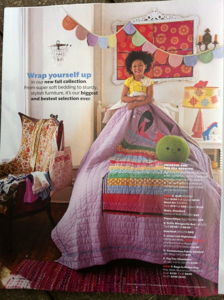
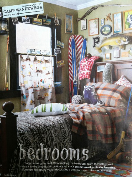
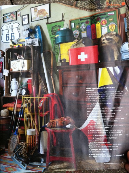
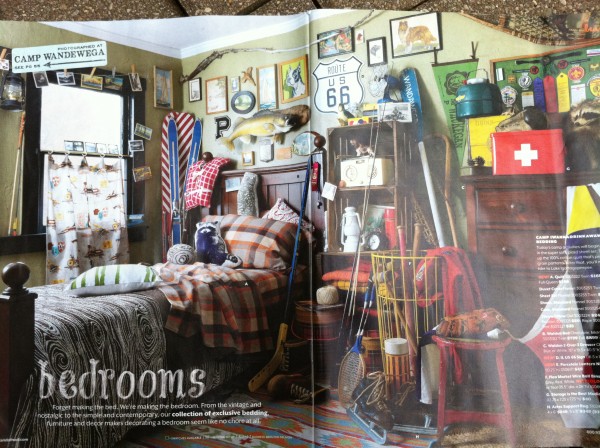
They must have gotten a new set of merchandise designers and or stylists because I thought their latest catalog was pretty fantastic, especially since it included Camp Wandawega. The styling included loads and loads of great vintage details. Take a look, but before you do be warned that these photos are pretty horrendous! They were taken from a crumpled up catalog with an iphone. Hey, I was just working with what I had.

Talk about a feel good catalog!

I’m always a sucker for a good boys room, especially if it includes plaid or stripes, so the last 3 images absolutely killed me when I saw them. I just might have to order my son those fantastic plaid sheets. And the styling of the last few images is great!

After flipping through this catalog I was quickly reminded that a few months ago we had a customer who is a prop stylist for Land of Nod (and a few other stores) and was buying vintage props for Land of Nod window displays here in the area. I just might need to take a trip to the Oak Brook store and check out the displays.

I swear that every last vintage detail you can find in this catalog, we probably carry or have carried in our store. Basically, this catalog is Gather & Collect approved.

So, here’s a nod to the Land of Nod and cheers to a vintage life well lived.

Jessica and Julie
Inspiration

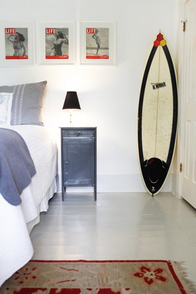
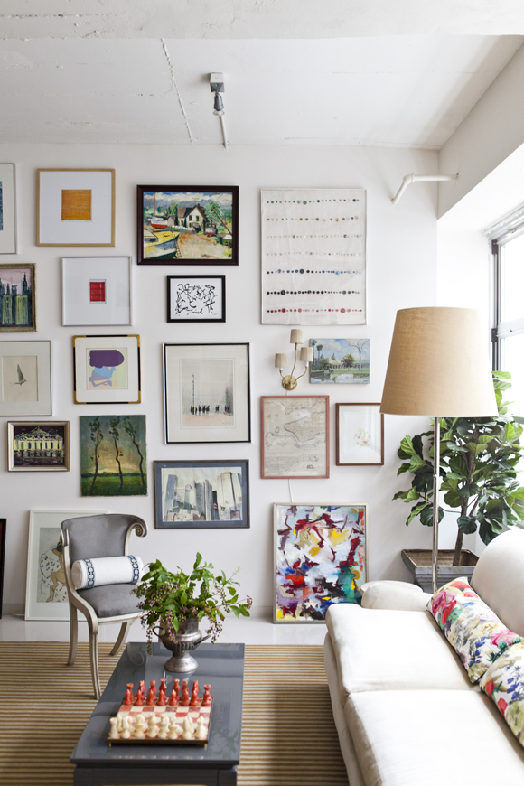
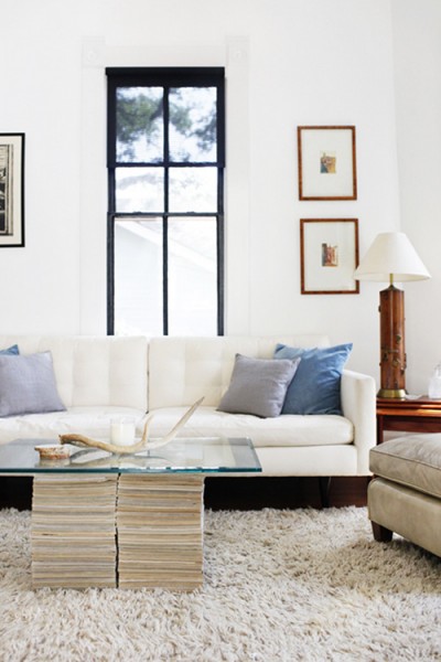
Isn’t this an amazing art wall? And the room, it just feels so good.

IMG_3034

(found here)

I find images like this completely inspiring. Lovely art, lovely furniture, lovely light. And none of it is high end or precious. But everything is pulled together in just the right way.

Cheers to a vintage life well lived.

Jessica and Julie
red table inspiration

Remember this post I did last week creating this mood board around one of our red tables found in the store?


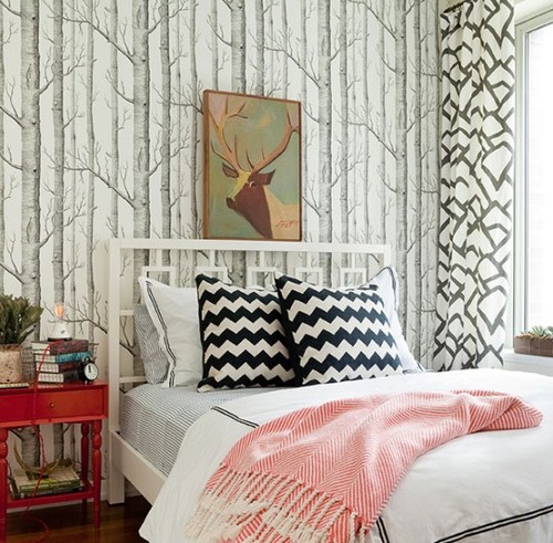
Well, I came across this room that was nearly identical in color palette and feel to that mood board, so I thought I’d share.

(via)

And take a look at that great paint by number above the bed (in the “forest” mind you;). See, EVERY room looks and feels better with a little vintage mixed in. It keeps things from looking predictable and boring. Experiment with color and pattern. Mix colors and texture you never thought would look good together. Break the rules and have fun doing it!

Cheers to a vintage life well lived.

Jessica and Julie